DIVERGENCE
Enough esoteric wandering. The original version of this assignment focused on the relative value of draft picks in the NHL. This version has a more specific question. What might picks in the range of pick 31 conceivably yield? How often do picks in that range yield players of Elias Lindholm’s value?
I guess we’d better figure out what Elias Lindholm brings to the table.
Can you find him in our existing data? Can you think of a way to highlight him in the context of number of games played? What other kinds of data might we need to fairly evaluate Lindholm and pick 31?
You will be surprised how these seemingly simple questions force you to explore the nuances of working with and visualizing tabular data.
Answer
It seems that picks around the 31st position don’t typically yield high-value players. Based on the SCATTERPLOT WITH OVERALL DRAFT POSITION and SCATTERPLOT SUMMARY, player performance (measured by Totgames) decreases as draft rounds progress. Therefore, it’s unlikely the Canucks would draft a player as consistently impactful as Elias Lindholm with that pick.
To make a fair evaluation of the trade’s worth, we need to know Lindholm’s post-draft years.Looking at “Postdraft years and NHLgames total” suggests that players generally peak within 4-6 years. So knowing Lindholm’s current performance is crucial.This will help us compare his experience to prospects the Canucks could draft at 31.
(The following answer is still based on the 2023-year questions)
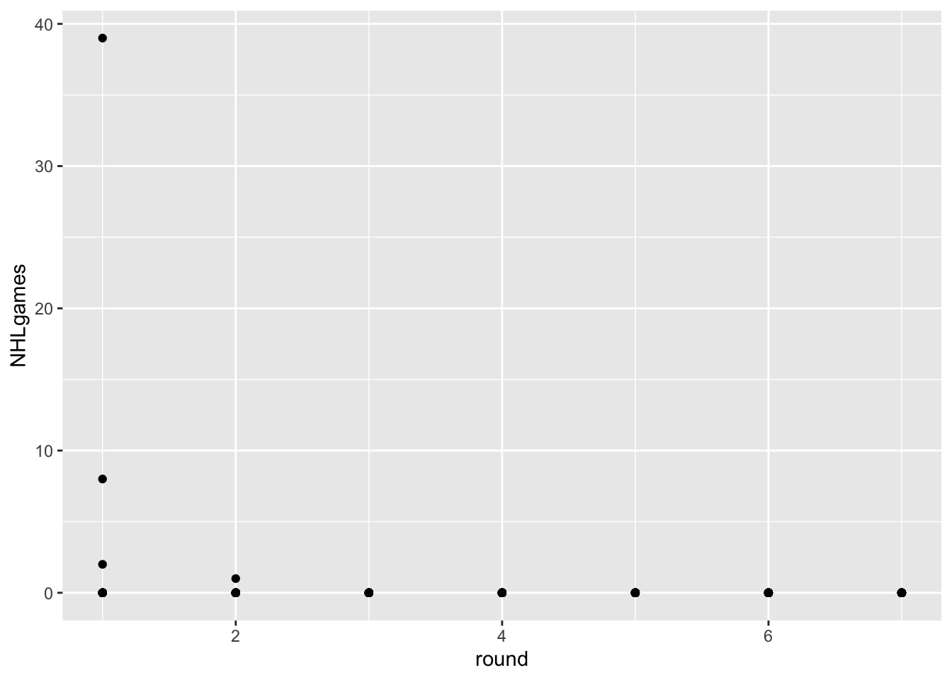
SIMPLE SCATTERPLOT
Picture
Question
Overplotting. All those points on the y=0 line represent about 32 players each. Can you think of a way that adding extra channels might help?
Answer:
We can use additional channels to distinguish the points, such as: Color, Shape, Size
Labelling. Can we create a solid figure caption and better axis labels for this figure? In your caption, please specify the task(s) the visualizaiton is intended to facilitate, as well as the marks, channels, and key-value pairs used.
Answer:
We can change the axis labels from “round” to “NHL Draft Round” and “NHL games” to “Number of NHL Games Played”. For the figure caption, we can write “Scatterplot of NHL Games Played by Draft Round”.
Task:To help users analysis the participation of players in NHL games from different draft rounds.
Points (marks):Points
Channels:Position
Key-Value pairs:(Number of NHL Games Played, Draft Round)
Key-Value pairs: Looks like we are using “round” as a continuous variable. Can we change this to an ordered factor?
- Although “round” has a certain order, the “distance” between two “rounds” is not continuous. Changing “round” to an ordered factor can more accurately reflect this relationship.
EXPANDED SCATTERPLOT
picture
Question
Overplotting. All those points on the y=0 line represent about 32 players each. Can you you think of a way that adding extra channels might help?
- Answer: Given the challenge posed by the small size of each plot, enhancing differentiation among the data points can be complex
Labelling. Can we create a solid figure caption and better axis labels for this figure? In your caption, please specify the task(s) the visualizaiton is intended to facilitate, as well as the marks, channels, and key-value pairs used.
Answer:
Figure Caption:
Scatterplot of the total number of NHL games played by players since being drafted, by draft round.
Axis Labels:
X-axis: Draft round (ordered factor)
Y-axis: Total number of NHL games played (continuous variable)
Points (marks):Points
Channels:Position
Key-Value pairs: Looks like we are using “round” as a continuous variable. Can we change this to an ordered factor?
- Yes
SCATTERPLOT WITH OVERALL DRAFT POSITION
Picture
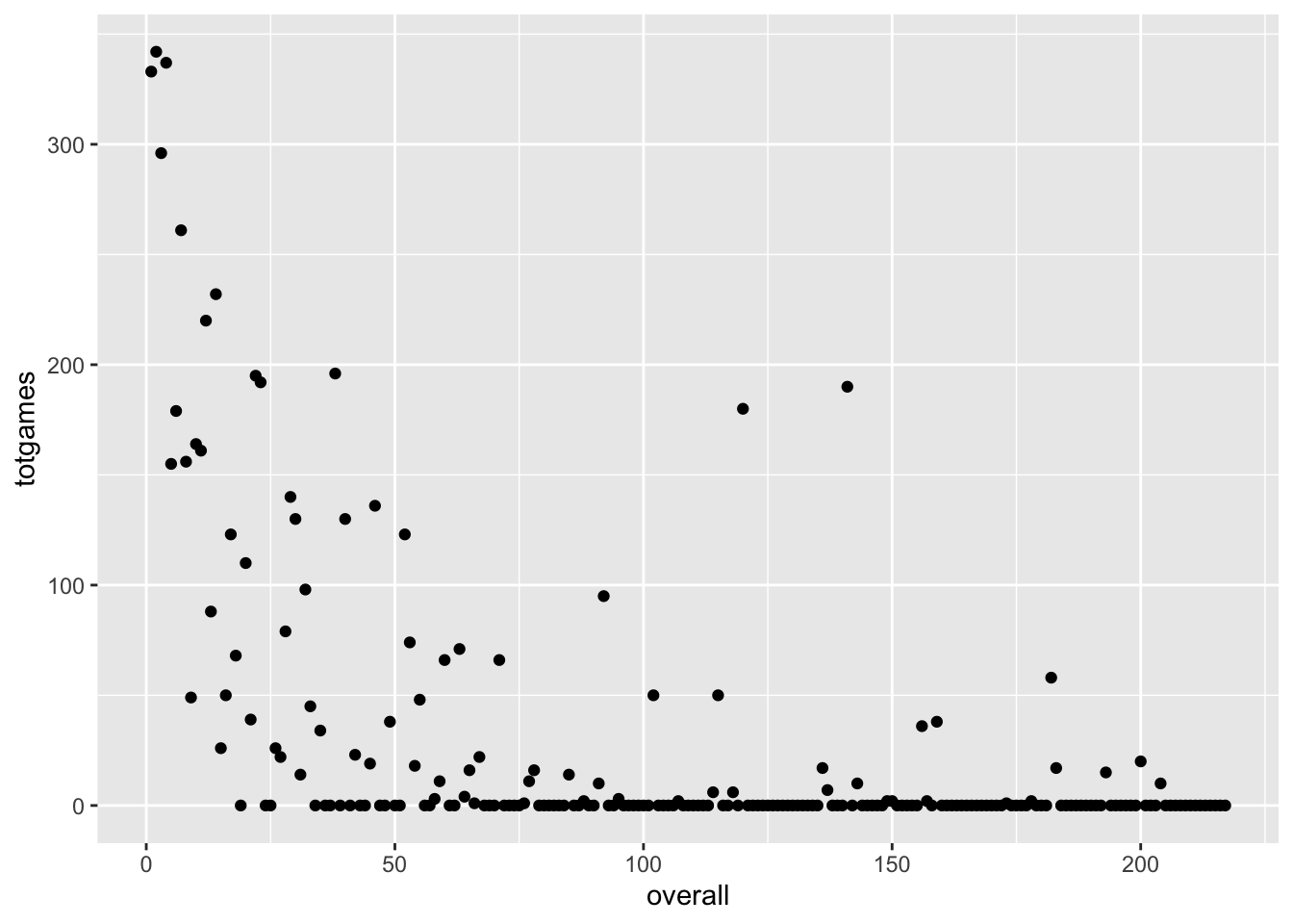
Question
We are trying to address the notion of trading a pick from round 1 for picks from round 2 and 3. Add visual channels to this plot that will help us make that decision.
- Answer:To address the strategy of trading a first-round pick for second and third-round picks, adding color coding to the visualization can greatly enhance decision-making clarity. Specifically, we could represent first-round picks in red, second-round picks in yellow, and third-round picks in blue. This color scheme will provide an immediate visual distinction between the rounds, aiding in the evaluation of the value proposition of such trades。
Create a caption and better axis labels for this figure.
- Answer: For the figure caption and improved axis labels, a proposed caption could be: “2018 NHL Draft: Analyzing the Impact of Draft Position on Career Progression.” The horizontal axis label could be refined to “Overall Draft Position,” clearly indicating the sequence in which players were selected in the draft. The vertical axis label could be enhanced to “NHL Games Played,” directly correlating the draft position with professional performance metrics.
What if we wanted to use more than just the 2018 draft class?
- Answer: To incorporate data beyond the 2018 draft class, creating separate scatter plots for each year could be one approach. Alternatively, integrating the data into a single comprehensive chart using varied colors or markers to differentiate between years could provide a holistic view of trends over time, facilitating a more informed comparison across different draft classes.
SIMPLE BAR CHART
picture
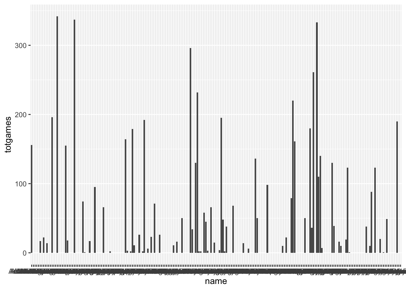
Question
Adding a visual channel indicating draft round.
- Answer: To visually represent the draft round in our analysis, we can employ color coding for the bars, each color representing a different draft round.
Fixing the order of the x axis.
- Answer: Regarding the organization of the x-axis, it would be beneficial to arrange it according to the overall draft position. This arrangement facilitates an intuitive analysis of the relationship between draft round and overall draft position, aiding in the decision-making process.
Making a caption and better axis labels.
Answer:
- a suggested caption is: “2018 NHL Draft: Analyzing Player Performance by Draft Position.” This title concisely communicates the chart’s purpose. Enhancing the x-axis label to “Overall Draft Position” and the y-axis label to “Total NHL Games Played” will clarify the axes’ significance, focusing on the broader trends rather than individual player names.
Fixing the values of the x axis labels so they aren’t such a mess.
- Answer: To address the clutter of x-axis labels, substituting individual names with their overall draft positions is a practical solution. This approach maintains the chart’s relevance to decision-making by emphasizing positional data over personal identification, streamlining the visual representation for better analysis.
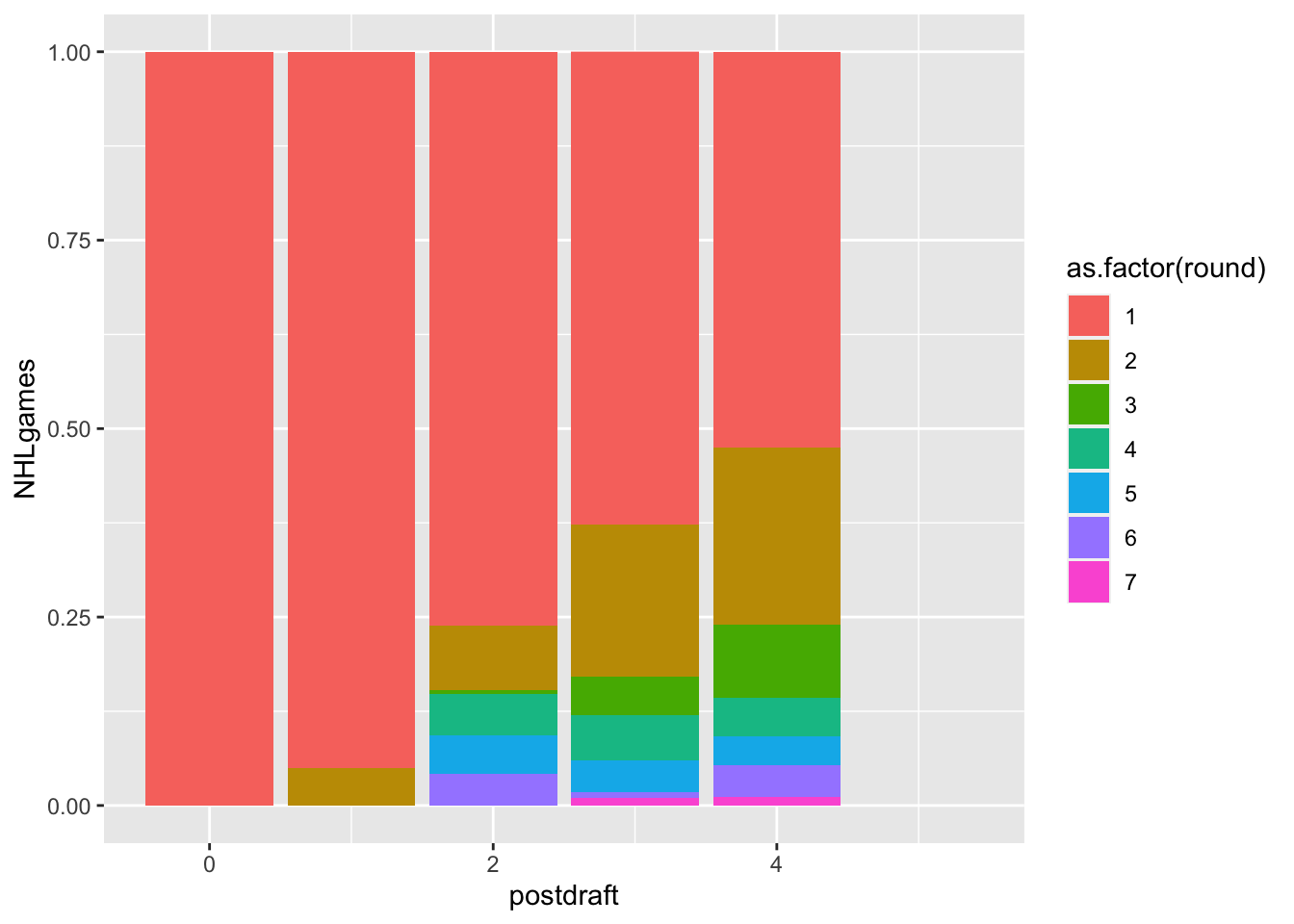
STACKED BAR?
Caption and Labels:
Answer:
An appropriate caption would be: “Distribution of NHL Games Played by Post-Draft Year and Draft Round.”
Improve the x-axis label to “Post-Draft Yearsince Draft”
Improve the y-axis label to “Cumulative NHL Games Played”
Color Palette:
- (None)
Data Beyond 2018:
- Answer: Regarding the inclusion of data beyond the 2018 draft, integrating multiple years of data could enrich the analysis, offering broader insights into draft trends and player development over time.
Order within the Stacks:
- Answer: For the order within the stacks, prioritizing the first round is essential due to its significance. Placing first-round data at the top of the glyphs will highlight its importance, visually emphasizing the impact of first-round picks on player performance in the NHL.
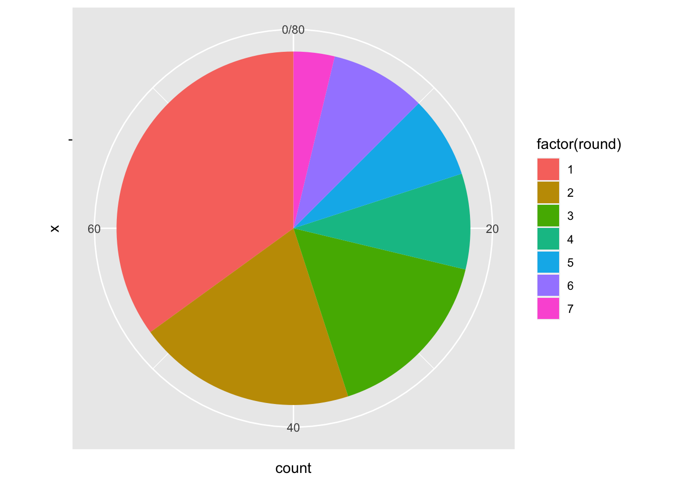
PIE CHARTS / NORMALIZED BAR CHARTS
Picture
Question
Obviously this isn’t great, but can you state why? Write a little critique of this visualizaiton that:
Considers a player who played hundreds of games over their first five years vs a player who played one game in five years.
Evaluates the relative value of a second round pick and a third round pick.
Answer:
A player who has played hundreds of games is weighted the same as a player who only played one game, which does not reflect their actual contribution to the league or their team.
It’s challenging for the viewer to assess the relative difference between the number of players from the second and third rounds, which is crucial when evaluating the value of draft picks from these rounds.
Picture
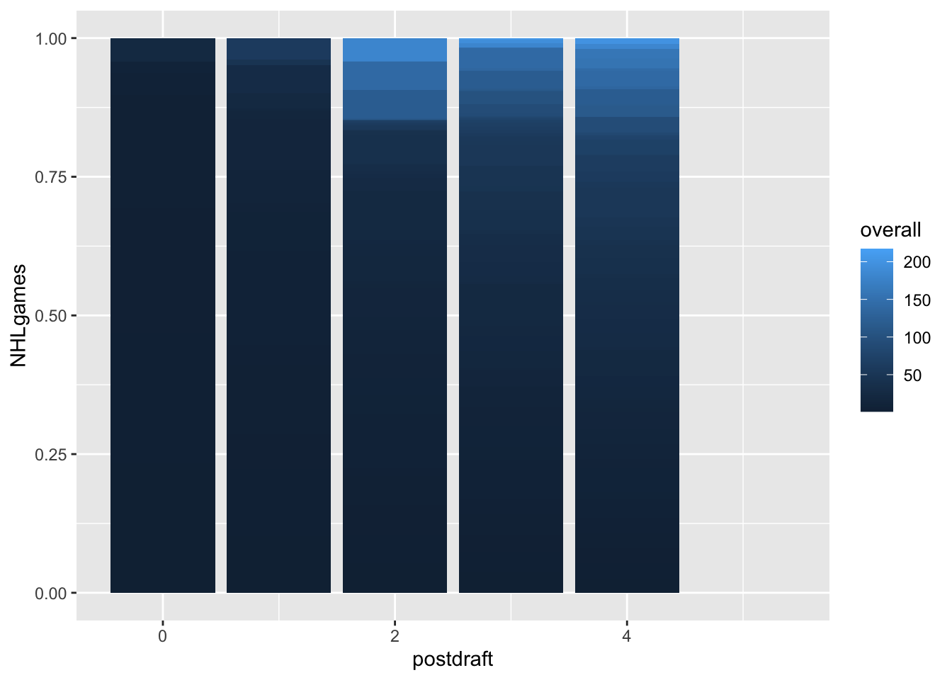
HEATMAP
Picture
Question
Could this be useful?
- Answer: it’s useless. Because you cannot extract any useful information from these two pictures.
OTHER STUFF TO CONSIDER
Question
Do these visualizations change as a function of player position?
Answer: Certainly, player position significantly influences career trajectories, including the typical length of a career, the number of games played, and their development paths. Different positions have varying demands and expectations, which can impact the metrics used to evaluate a player’s success and contribution.
Is the number of NHL games played really the best metric to use?
Answer: Regarding the metric of NHL games played, it is not the most comprehensive measure of a player’s potential or contribution. Relying solely on this metric can overlook important aspects such as the quality of performance, impact on team success, and other valuable skills brought to the game. A more holistic evaluation should incorporate multiple metrics to capture a player’s overall impact and value more accurately.
CONCLUSION
Answer:
In conclusion, trading decisions should be made with caution. The data suggests that players selected in the first round typically participate in more NHL games in their draft year and cumulatively in post-draft years, indicating a higher potential value compared to second and third-round picks.